Our Product Marketing Manager Marc looks at some excellent examples of on-site messaging…
On-site messages are becoming an increasingly familiar part of the online shopping experience. After fighting the competition to attract visitors to their sites, online retailers are becoming smarter about how they can make sure these shoppers stick around and buy.
Whether using on-site messages to make an announcement, collect more email addresses, or provide customer service, their intent is to enhance the customer experience online and turn more visitors into customers.
Check out these seven examples of on-site displays that increase online conversions.
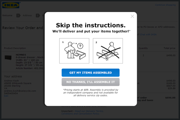
1 IKEA
I’m sure just the thought of having to assemble IKEA furniture is enough to make some visitors want to abandon the purchase! Identifying this as the perfect up-sell opportunity, IKEA asks customers just before payment if they’d like to have their items assembled after delivery.
With a cute illustration of the dreaded instructions, alluding to what may come next, IKEA subtly highlights to their customers that the additional expense may actually take some of the pain of the purchase away.
I’m sure this handy on-site message can be credited for saving a few relationships too!
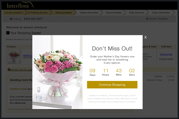
2 Interflora
There is nothing like a looming deadline to spur people into action. And when it comes to Mother’s Day, that’s really one you can’t afford to miss.
Displaying an on-site message with a countdown timer at the point a visitor either shows intent to leave or has been inactive for a period is a great way to pull them back in. Counting down to the end of a sale, a discount or free shipping adds a helpful dose of urgency to speed up a visitor’s decision process.
Interflora have done just that, showing the order deadline for delivery on Mother’s Day. This encourages advance orders as visitors don’t want to miss out during this high demand period.
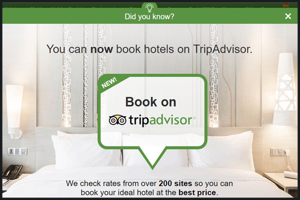
3 TripAdvisor
On-site messages are not always about driving a conversion at the point of display. TripAdvisor used this message on exit intent to help change the perception of who they were as a company.
So many travelers got accustomed to relying on them for reviews, then leaving to another known booking engine to make the purchase. When TripAdvisor became a booking platform of their own, they needed visitors to know about it.
TripAdvisor played on this abandonment-to-book behavior, and showed an informative ‘Did you know?’ message on exit. The inclusion of a price guarantee was another reminder to show there was really no reason to look elsewhere.
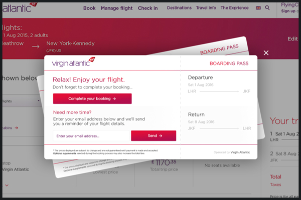
4 Virgin Atlantic
The online booking process can be stressful, with a lot of time put into planning the perfect trip. Weighing up the different options available, and ensuring you have all of the information required can be time-consuming, especially when there are multiple travelers involved.
Virgin Atlantic address this issue by displaying a message giving visitors the option to save the itinerary they’ve created with a handy route back to purchase when they’re ready. Just input your email address and they will send you a full copy.
The clever design also shows two tickets when multiple travelers have been selected, making a nice break from the usual box display.
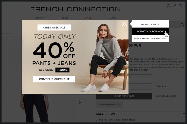
5 French Connection
No thanks? Not so fast. While discount codes are a tricky one to champion for regular use, they can be effective in on-site messages when they come as part of a larger or limited time sale.
French Connection’s exit intent message displays a reminder of a daily sale on the items that are being abandoned. The discount code is displayed to incentivize the visitor to continue with their purchase, but if they close the window they are presented in three options for how to proceed; would they like to save the voucher code, use it now, or simply leave?
Showing these options is a way of checking if the intent to leave was genuine, and gives the user a second chance to consider the offer.
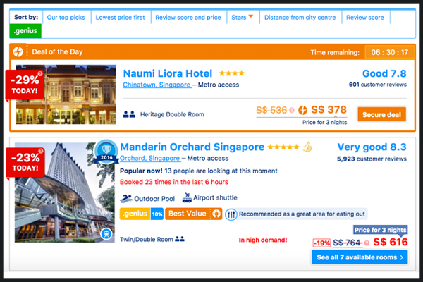
6 Booking.com
Booking.com are anything but subtle when it comes to their urgency messaging. Countdown timers, live trends, social proof, price guarantees.. Booking.com have covered it all.
All of these tactics play on typical consumer behavior, encouraging visitors to make faster purchase decisions, for fear of missing out on the best deal. Without this, we would be inclined to shop around, take our time, or put it off altogether.
Adding an element of scarcity, playing on popularity, and displaying guarantees all put the customer’s mind at ease, stop the need for shopping around and compel us to buy.
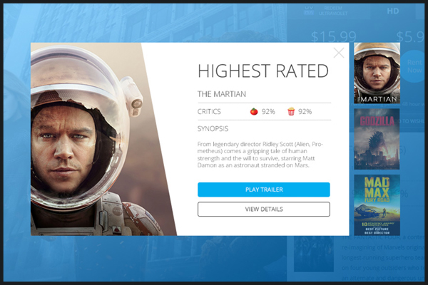
7 CinemaNow
Shoppers are constantly looking for validation of their choices. Consumer reviews and ratings can give them the confidence that they’ve selected something they’ll enjoy, and motivate them to buy.
CinemaNow incorporated reviews into their on-site message, along with the option to watch the trailer. This took away the need for the visitor to go elsewhere, with all of the information they needed in one place.
With 77% of customers looking to reviews before making a purchase, it makes sense to have these on hand when they need them.